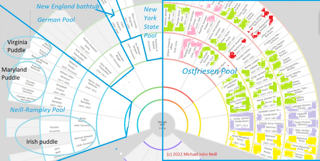
My map of ancestral pools just dumped all my maternal families into one pool. I decided that really wasn’t helpful as it stripped away the fact that these families were from six villages with most of them being from one village.
So I color coded it by village of origin. That reminded me which portions of my Ostfriesen pool were from the same village and which ones were from others. The thing I need to add is something showing the relative position of these villages and how close (or far away) they are from each other. That matters as well.
But is there some chart or organizational method you use where color could help?
Help support Genealogy Tip of the Day by visiting any of the following sites:
- Try a GenealogyBank Genealogy Search to see what you find.
- Newspapers.com
- AncestryDNA offers.
- Books on Michael’s Genealogy Shelf
- My webinars
- My 1950 Census prep webinar


5 Responses
This is a great idea. I love using colours in my research to help show groups and patterns, but hadn’t thought of doing this one.
I’ve thought about doing something like this only using a map.
A map preserves the geographic clues, which is not done here.
Michael, have you thought about doing a webinar on this topic?
Jane, Thanks for that suggestion. I have thought about it in the past, but it might be time to revisit it.