
This chart containing ancestral residences was mentioned in an earlier post. The chart itself could use some revision and modification.
The pedigree chart layout–I’m on the far left, then my parents to the right of me, then my grandparents to the right of them, etc. In hindsight, because a time line along the bottom might be helpful, I think I would flip the chart horizontally as shown in the draft image (note the locations are also flipped).
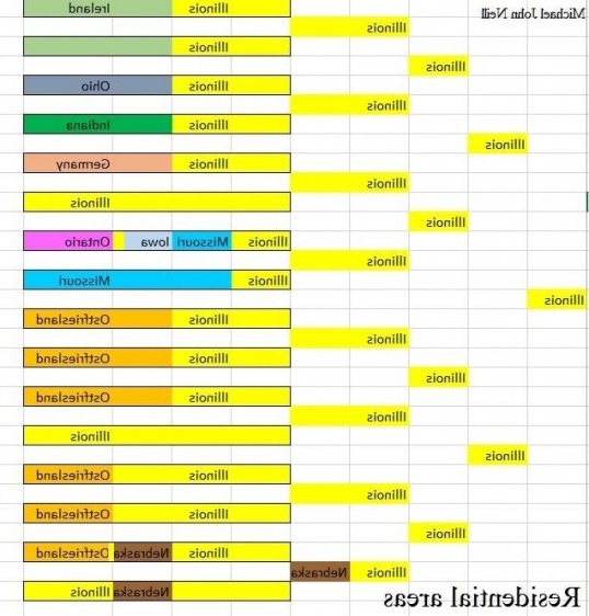
This would make the timeline along the horizontal easier to make and understand. Boxes would be shorter or longer based on individual lifespans which has not been done in the image.
I’d also make the colors similar for areas that areas that are geographically close to each other. It might be easiest to make a list of all the places that will be in the chart and think about colors before making the chart and just choosing them on the fly.
I used a spreadsheet to make the chart, but there are other ways it could be done.


No responses yet